F+F Kantine
The Museum of Circular Objects
F+F Kantine
Institution:
F+F School of Art & Design
2026
Keywords:
Identity Design, Canteen
Guided by:
Jeannine Herrmann
& Nick Bellinger

The Brief:
F+F Kantine aimed to grow beyond its existing student and staff audience and become an open, public food and coffee spot. While there were some existing printed materials, they were inconsistent.
The goal was to build a new identity with a clearer, more consistent visual presence that highlights its affordable, fresh regional food and inclusive menu, while attracting a wider audience.
Concept:
I took a geometric approach, building on existing elements to make the new identity feel familiar while bringing everything together. The aim was to create a cohesive visual system for F+F Kantine that felt thoughtful yet fun, with a consistent look across different touchpoints.
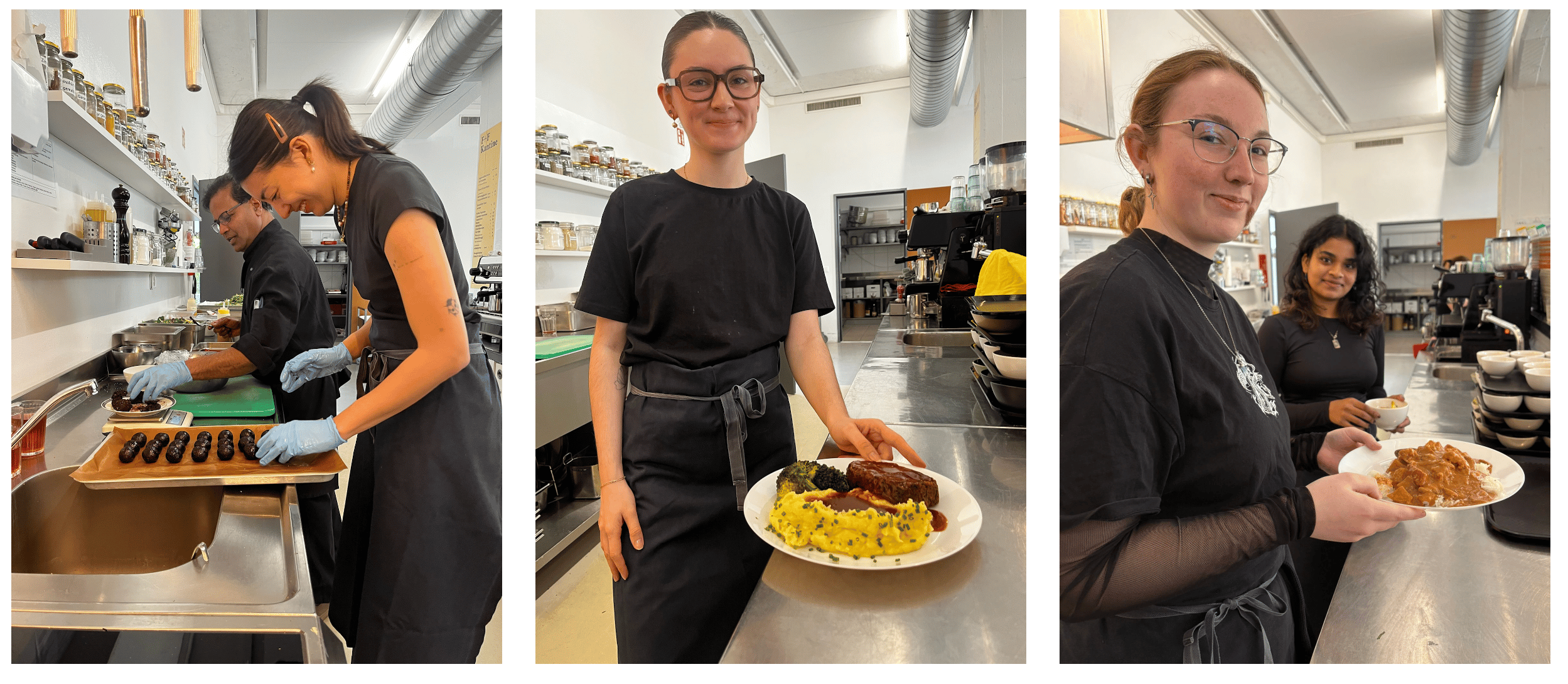
We began the project with an immersive research experience, spending a day working at the Kantine. By participating in its everyday activities and observing how the space functioned, we gained first-hand insight into its routines, people, and atmosphere, which helped with the development of the identity.
From here we all went our separate ways to create individual identities.
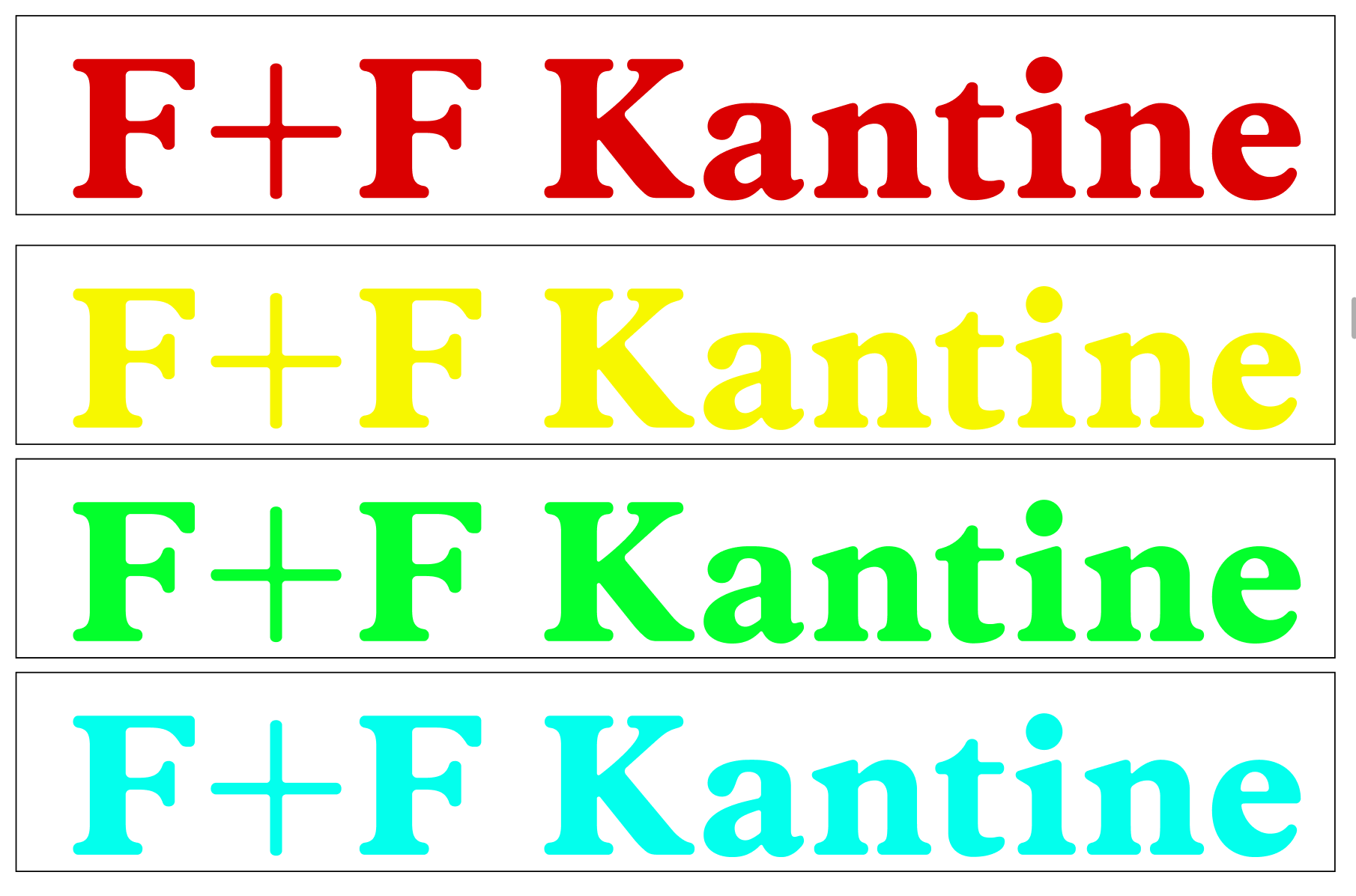
The logo remained unchanged, retaining the existing Index FF typeface to maintain continuity with the original identity.
These three symbols were already part of the existing identity, representing vegan, gluten-free and lactose-free options.

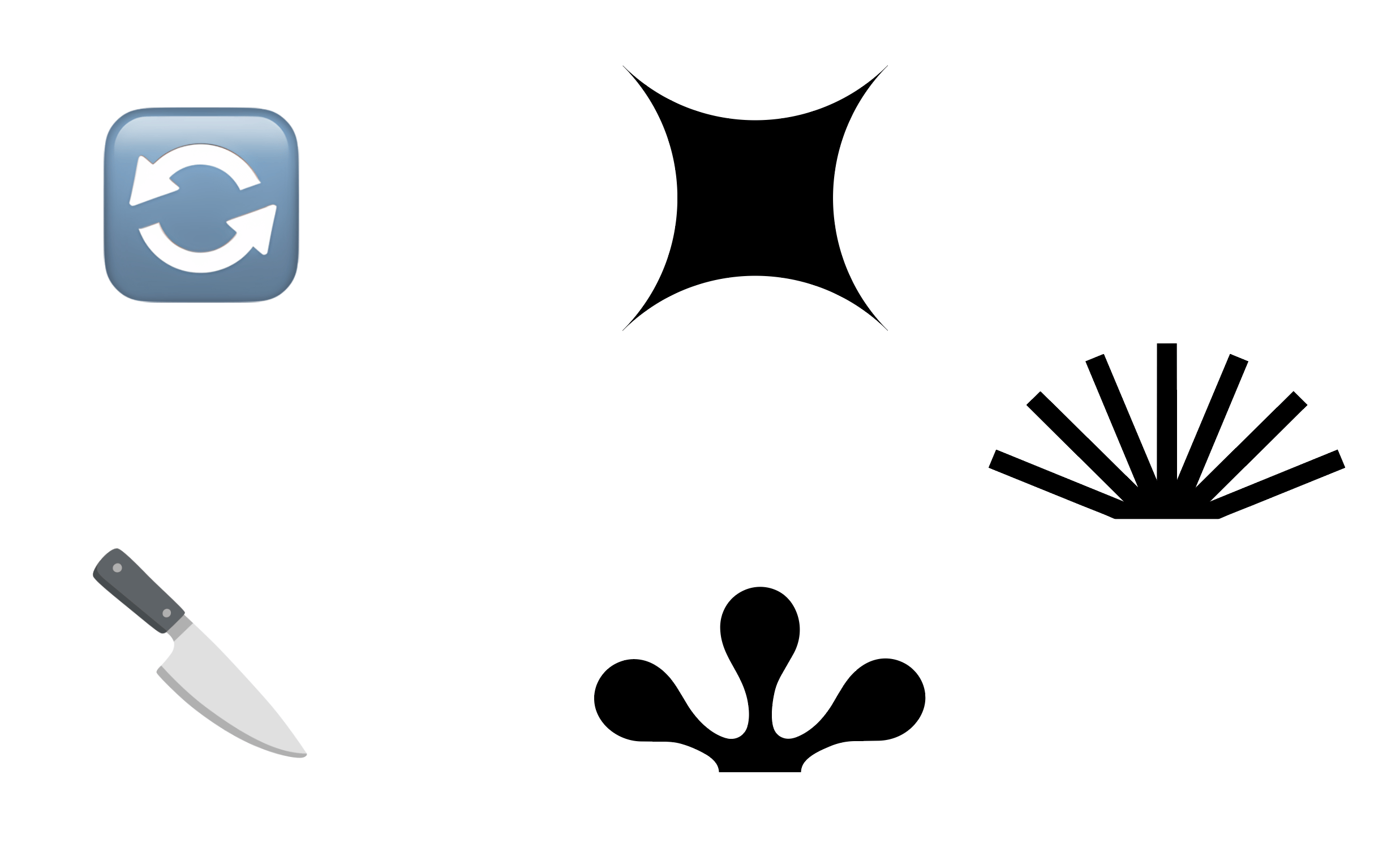
I took these symbols and cut and rotated them...
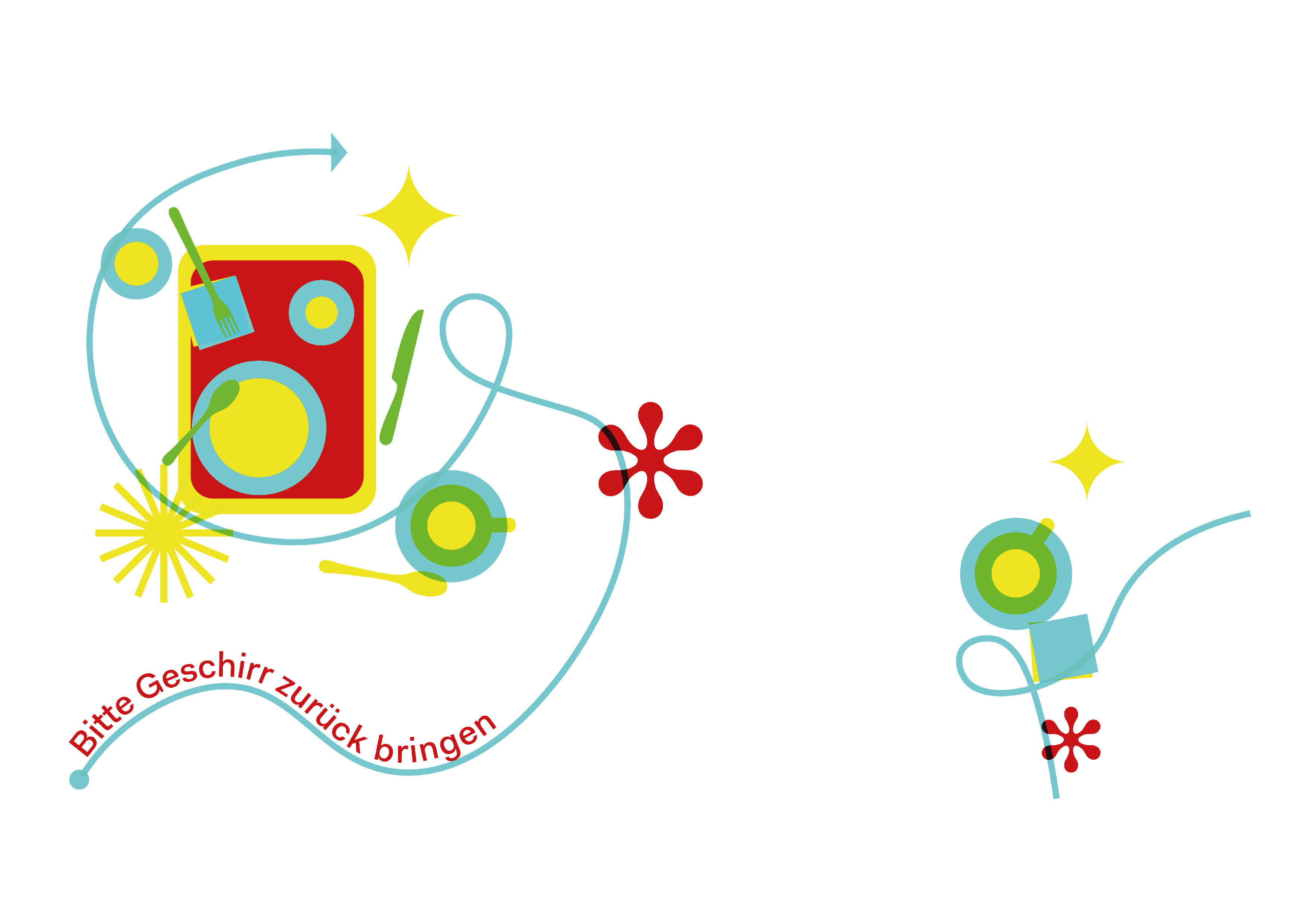
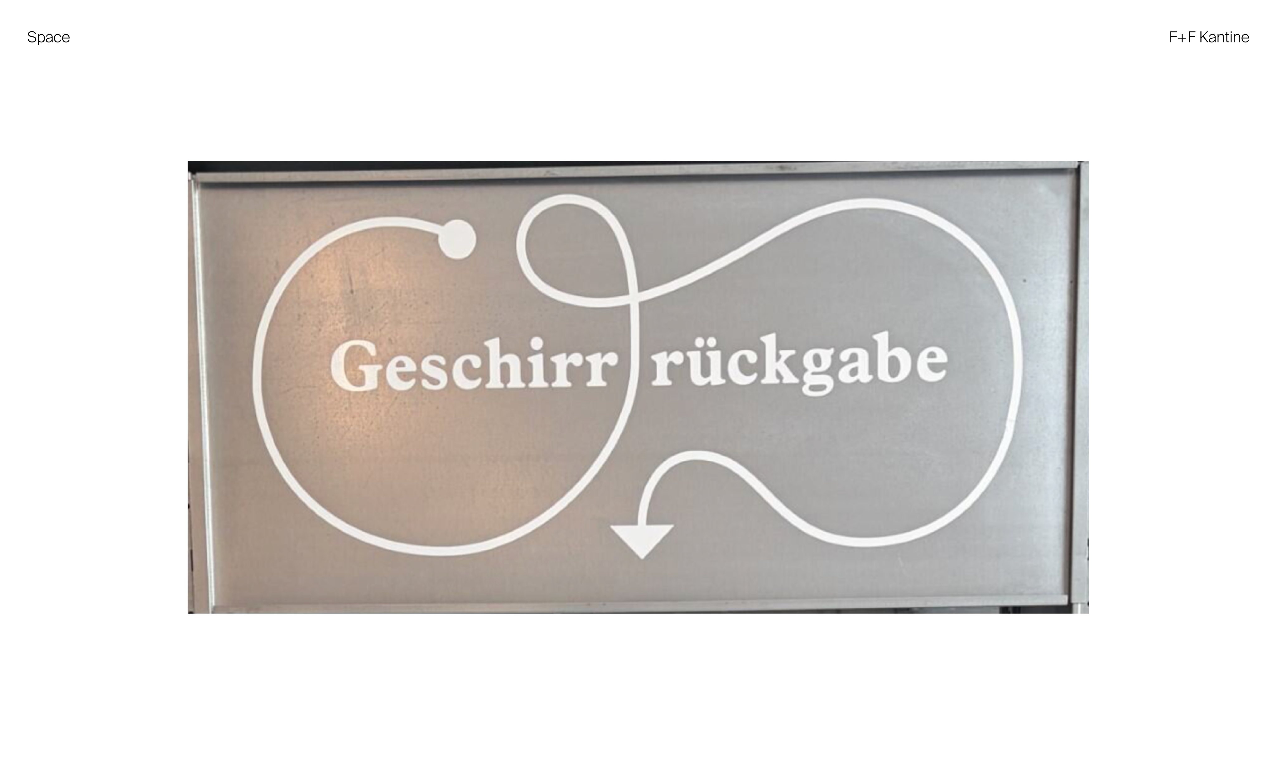
The arrow was already present on the station where people return their empty plates and utensils. I decided to incorporate this existing element into the identity, giving it a familiar connection to the Kantine while making it part of the overall visual system.
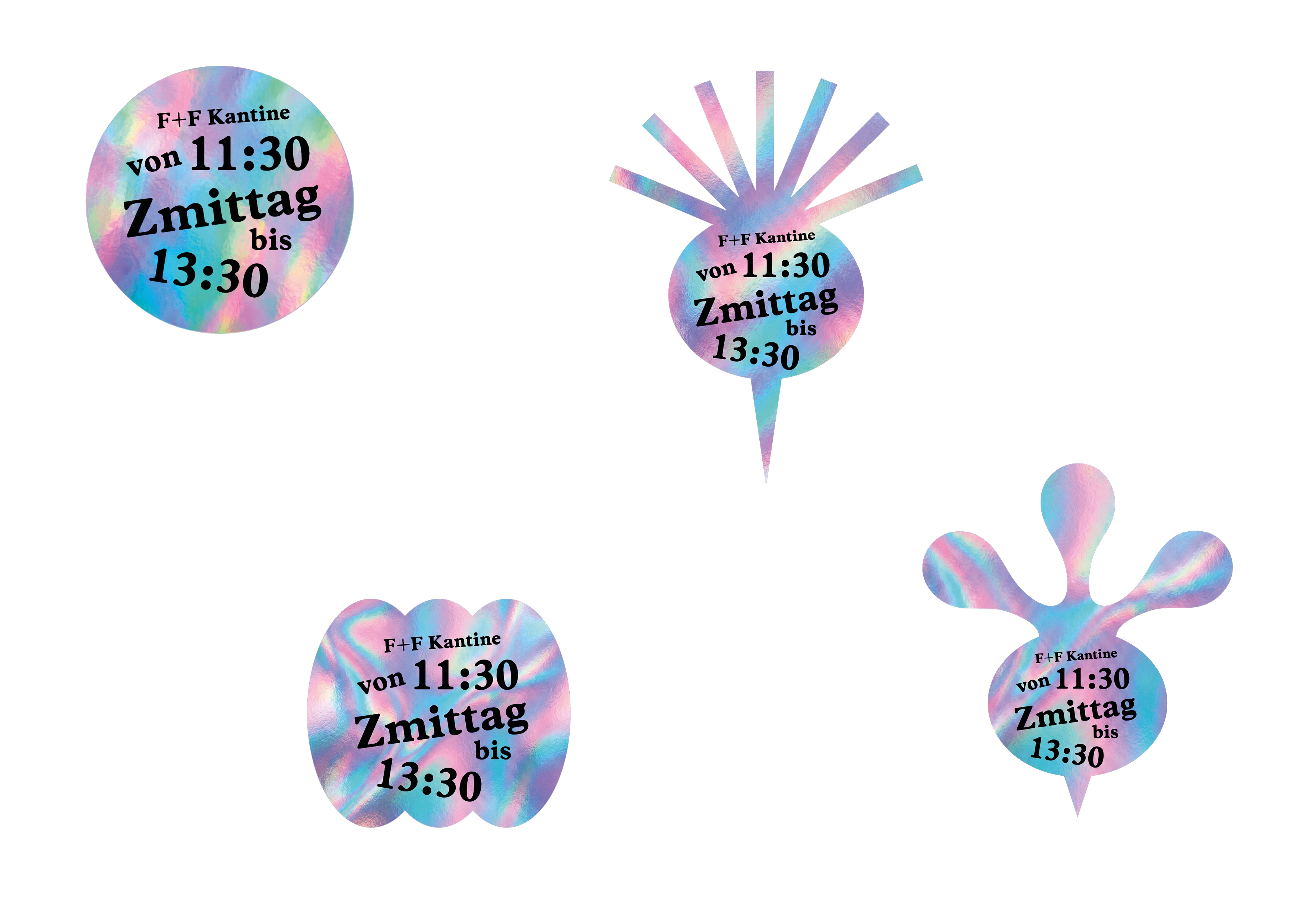
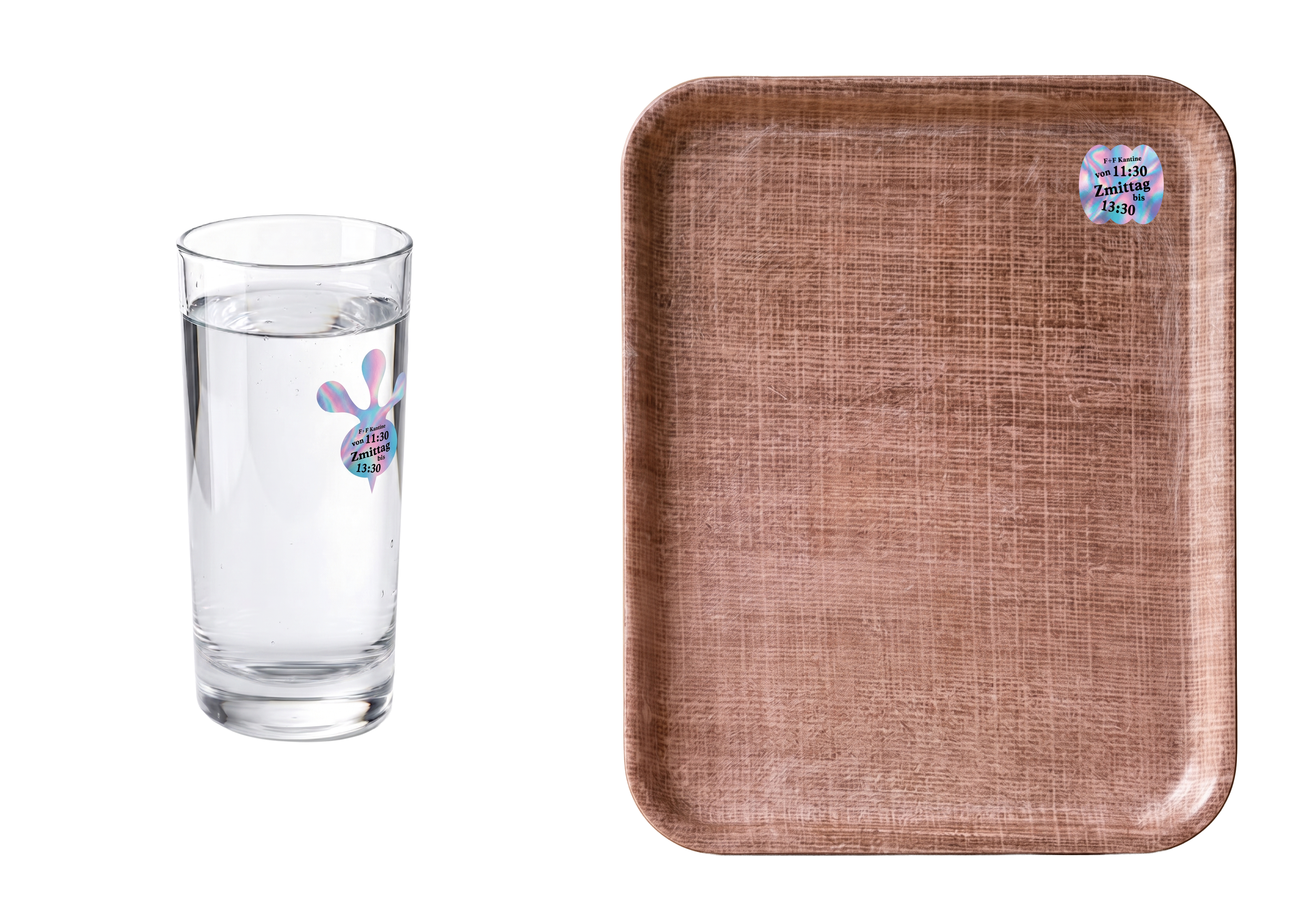
After designing the utensil stickers, I decided to print them on foil to make them stand out. I then carried this foil element across the other deliverables to tie everything together.
The next step was to design graphics for the glass doors leading to the outdoor seating area. Since customers pass through these doors when returning their utensils, I incorporated the arrow to guide them towards the return station and also incorporated utensils into the design. I also carried the foil detail onto the arrows, which would be gilded onto the glass.
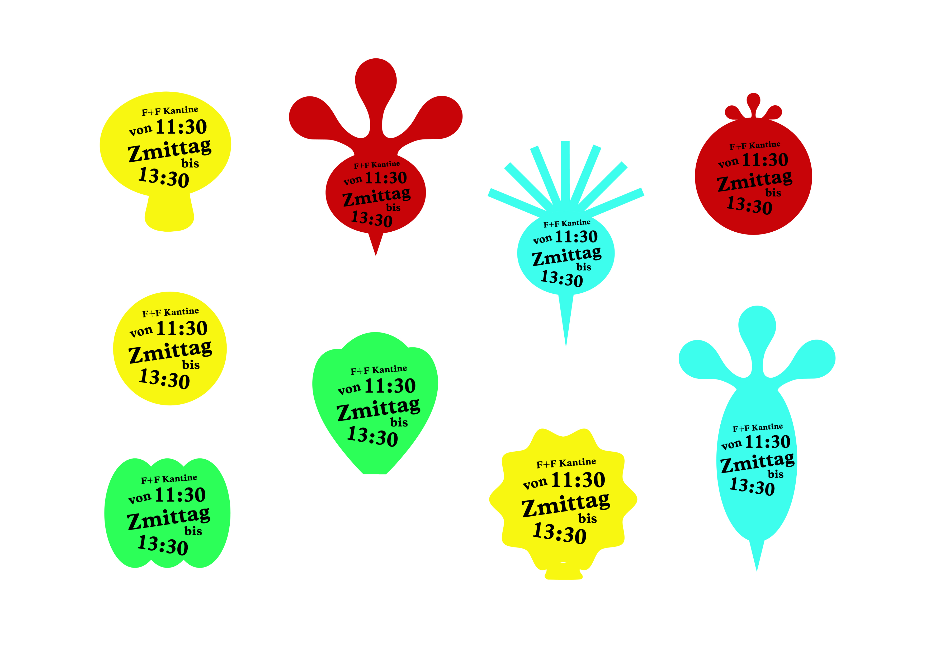
I also suggested having flags in the open area so more people are aware of the Kantine. So I created 3 flags to go together.
The client wanted the identity to reflect the Kantine’s connection to an art and design school. To make the space more fun, I came up with the idea of placing stickers on the furniture, so its clear the furniture belongs to the Kantine and they also let the identity extend into the space.
There was already an existing snail sticker, and since snails eat vegetables, I used it as the starting point.
I was able to visit a studio and get my designs Riso printed as well and the results are below.
Using the created elements I designed the business cards, poster, stand designs and the menus.
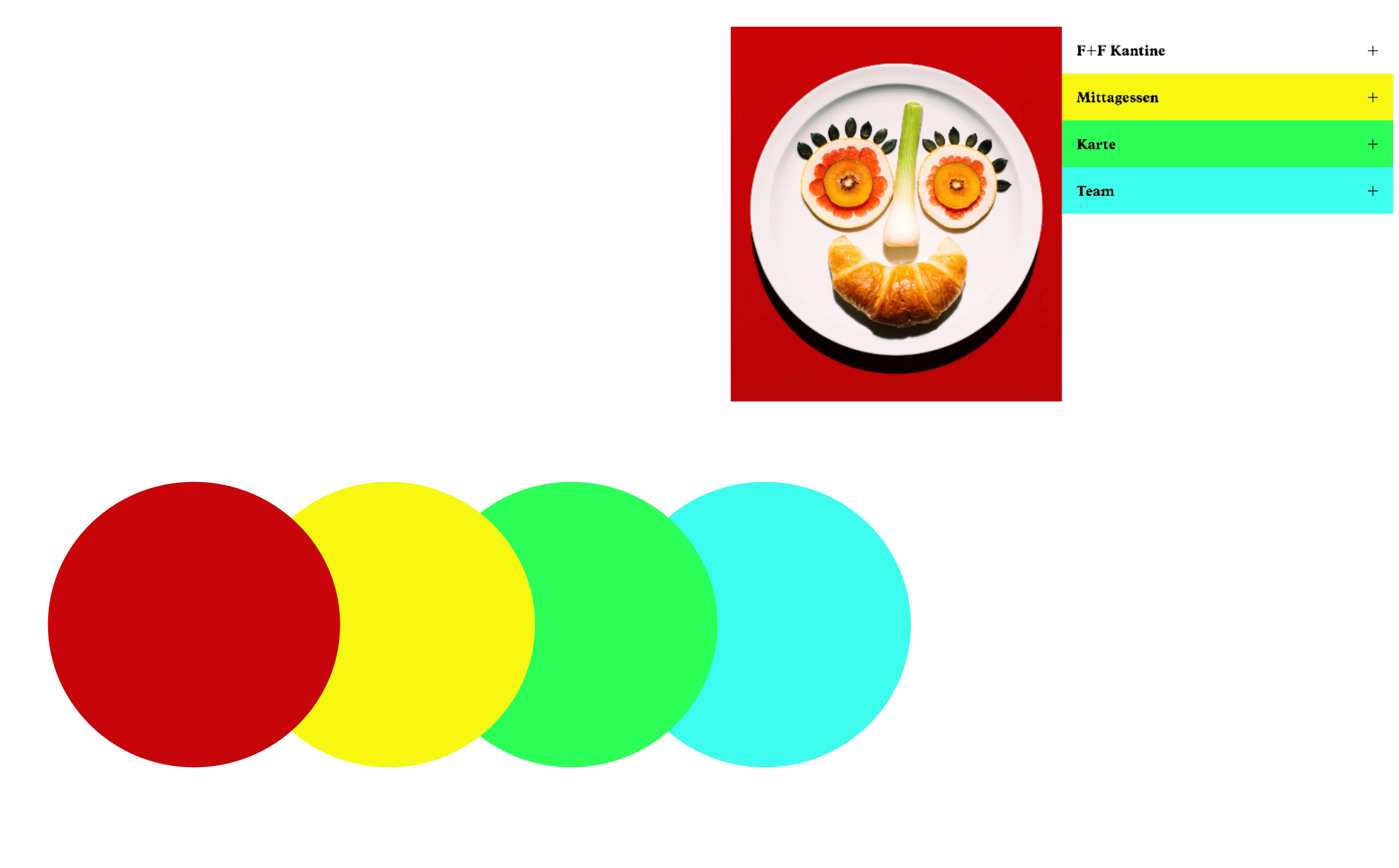
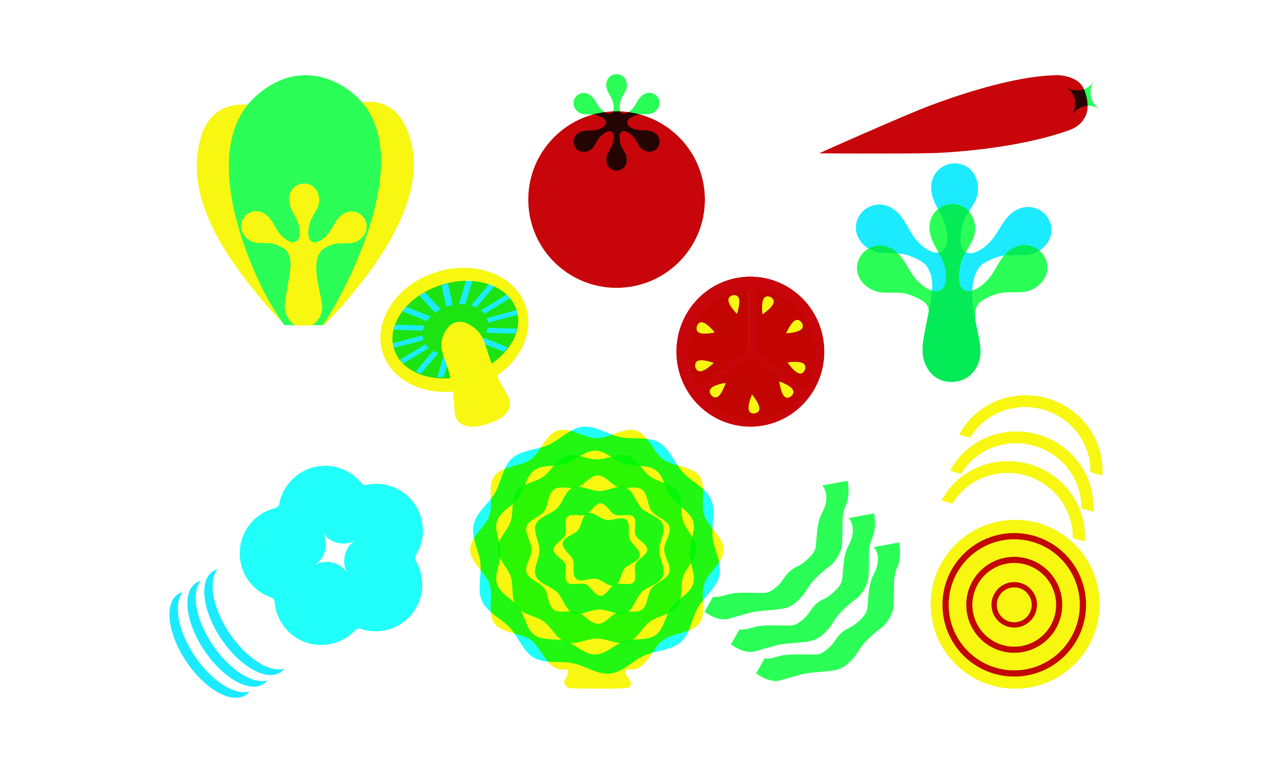
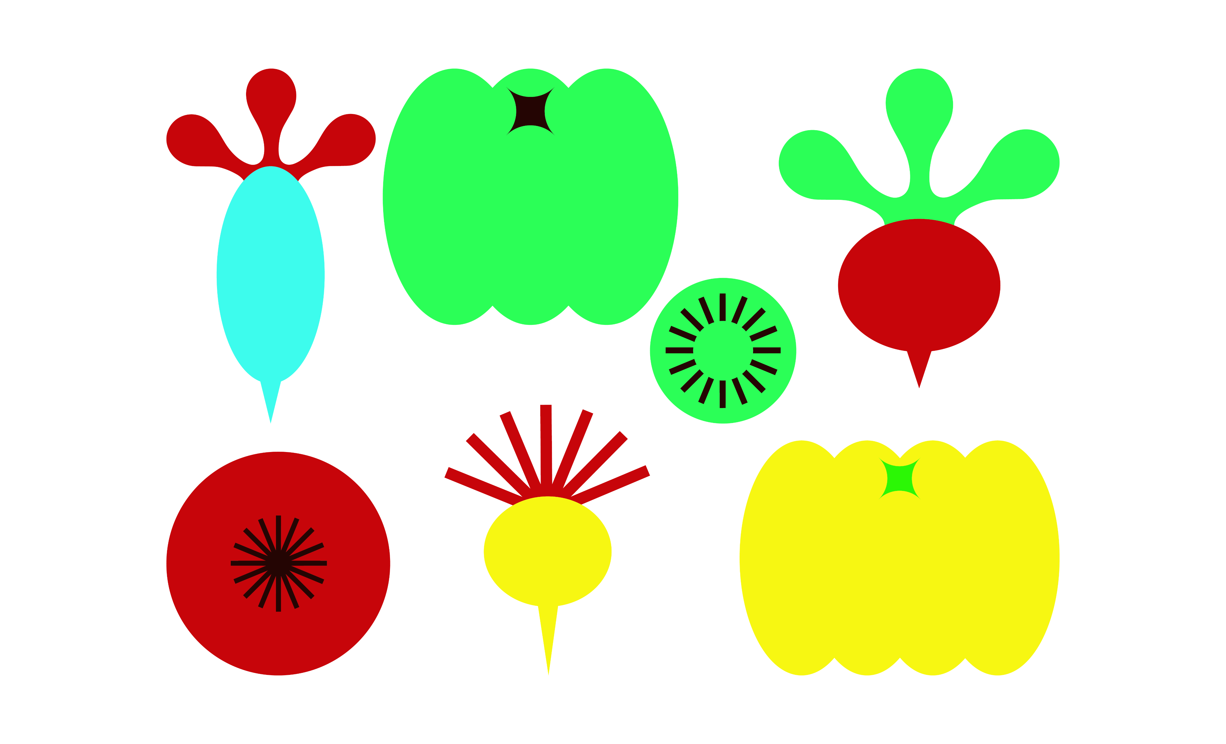
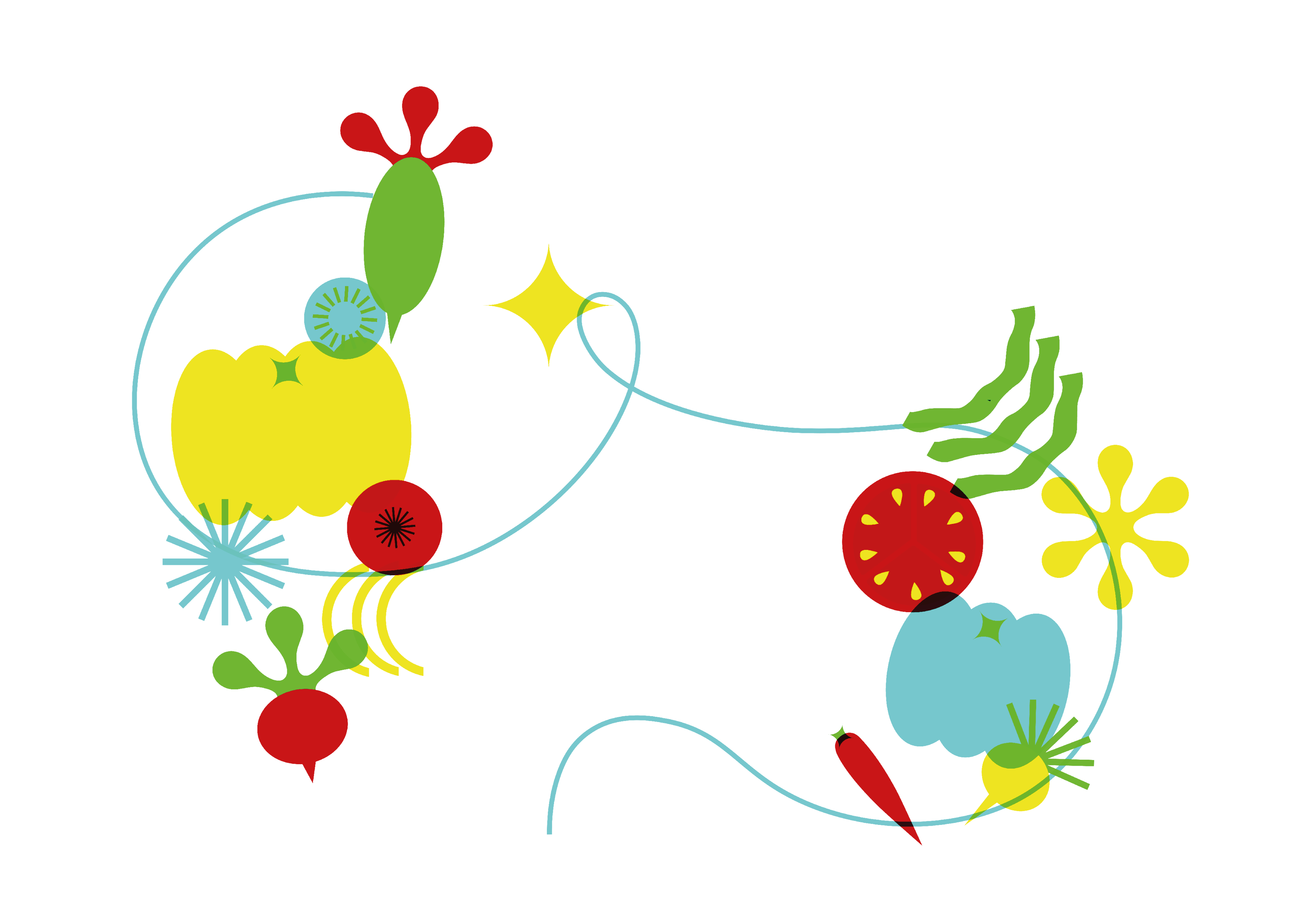
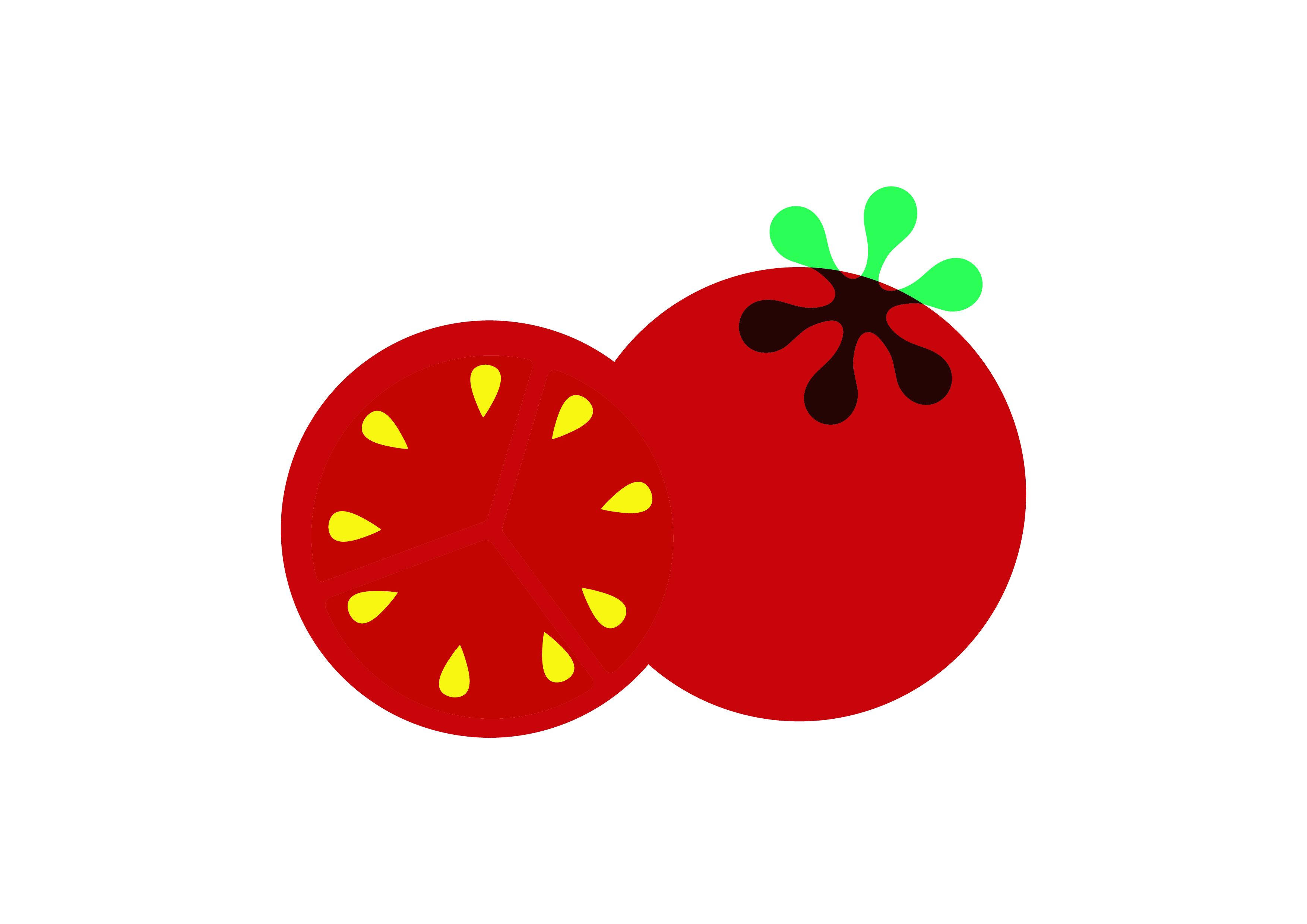
I used the existing colour palette from their new website to create a set of vegetable illustrations. We chose vegetables as the main visual element to reflect the Kantine’s focus on fresh, home-cooked meals.
The client did not want any prints to go to waste. I had brainstormed a few printing options, but after attending a risograph workshop and learning more about the sustainability of the riso printing process, I decided it was the best option for this project. Riso inks are translucent, allowing overlapping colours to blend and create a third colour. I designed the deliverables so this quality of riso comes through.
I took a few test prints with the designs I created which you will see further down.
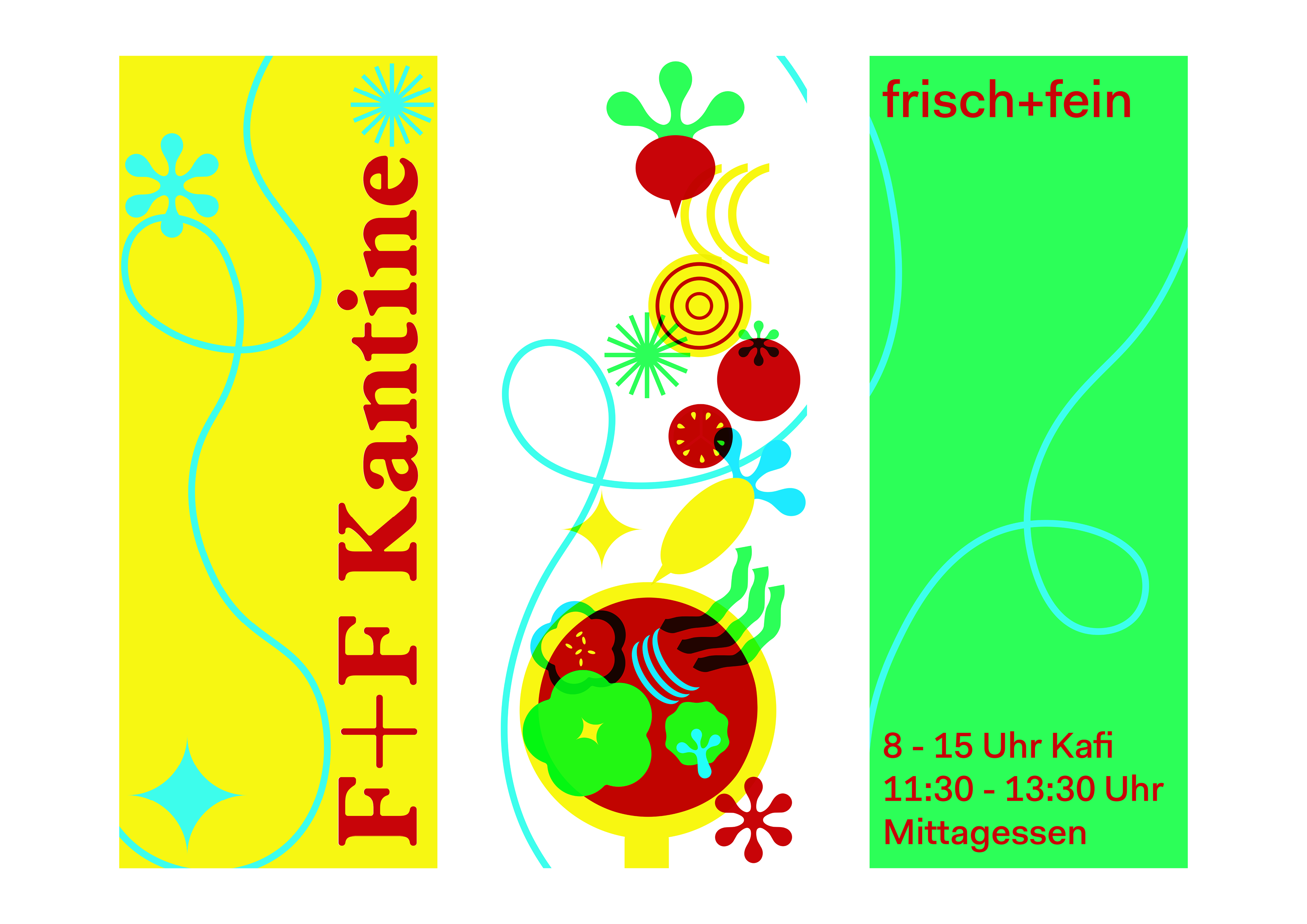

I also designed a 1 flag variation incase 3 flags aren’t feasible because of the budget.
About
Contact
Work
Play

OXID.
Measuring The Lotus
Jhankaar
D/SIGNED
Dhal ni Pol
Top
More Figma!