OXID.
The Museum of Circular Objects
OXID.
Institution:
F+F School of Art & Design
2026
Keywords:
Brand Design, Fashion
Guided by:
Franco Bonaventura
& Lela Scherrer

The Brief:
In collaboration with second-year fashion students at F+F, we were asked to design a brand identity for their future fashion brands.
I was paired with Mario, whose work had a strong grunge aesthetic. He was particularly interested in the textures of different materials, especially metal. The oxidation of metal was initially intended to be the main visual element and inspiration behind the brand.
This is the initial moodboard I created with Mario to figure out his likes and vision for the brand. There was a lot of focus on materials and textures.
I wanted the textures of the clothing to speak for themselves, so I kept the packaging and other deliverables minimal. One edge of the paper has a signature torn edge, which I carried across the business cards, envelopes, tags and packaging to keep it consistent throughout.
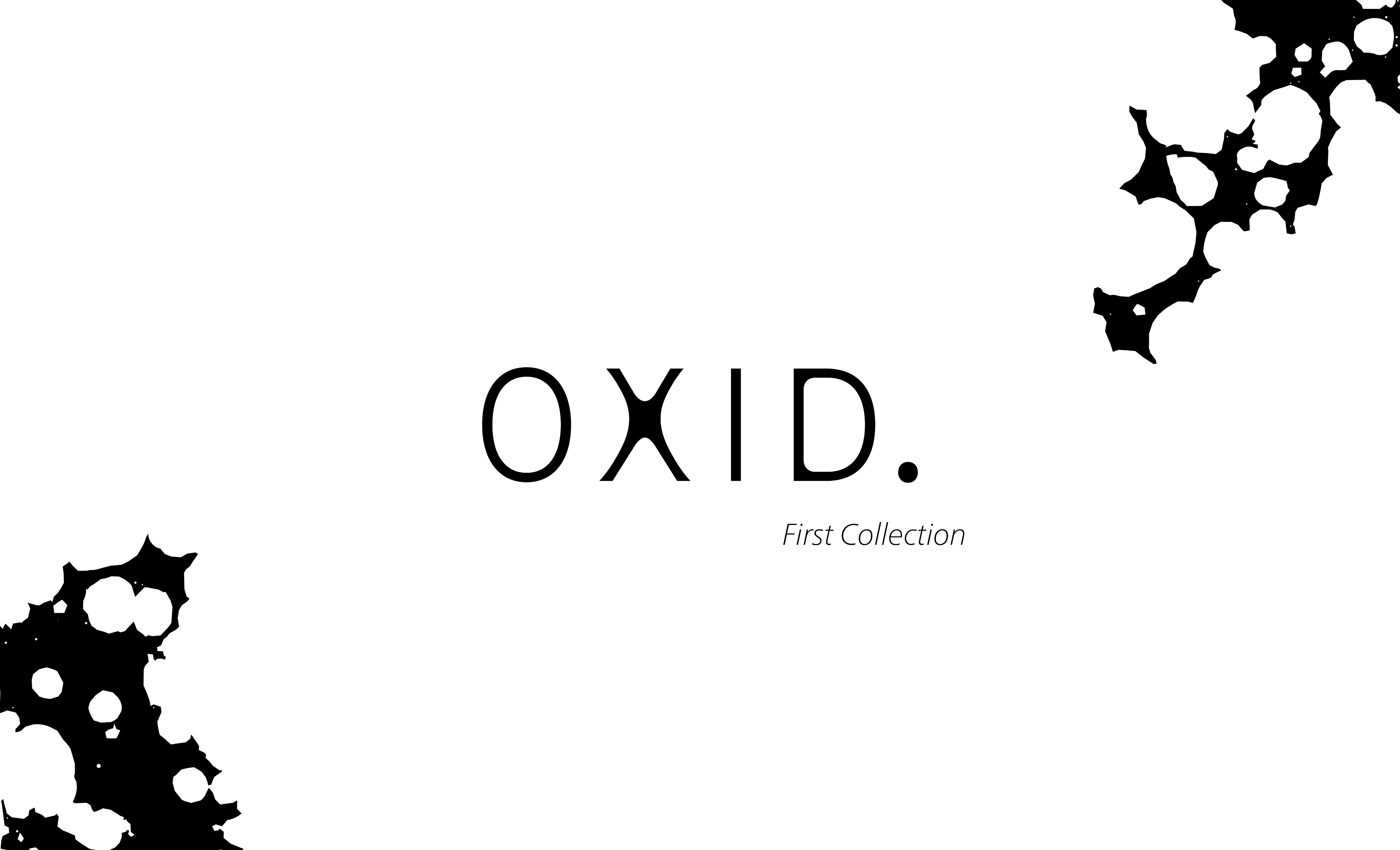
For the first collection I wanted the texture of the oxidation to be the centre of all
the collaterals.
I created a campaign for the first collection, with posters featuring the garments alongside teasers of the wordmark. The tagline, “Designed to evolve with wear, not despite it,” reflects OXID.’s ethos of creating clothing that lasts and ages naturally, becoming more beautiful with time and wear.
Concept:
OXID. is a grunge-inspired clothing brand that draws inspiration from the textures and natural aging of different materials. The clothing is designed using high quality materials that evolve with the wearer over time.
Materials such as denim and leather are chosen for the way they develop character through use, creating fades, marks, wear, and
a unique patina. Rather than seeing aging as damage, OXID. embraces it as part of the beauty and identity of each garment. Over time, every piece becomes more personal and unique to the person wearing it.
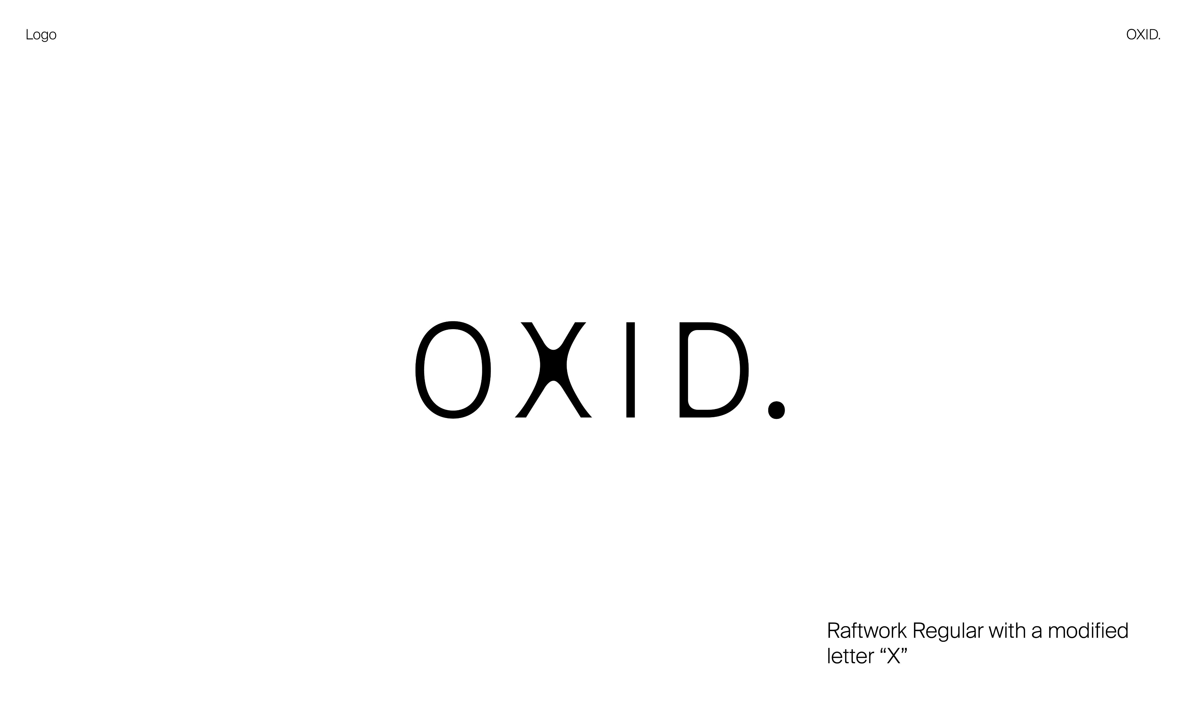
OXID. is short for “Oxidation”. The wordmark uses Raftwork Regular with a modified “X”. The mix of sharp and softened edges across the letterforms reflects the changing textures of oxidised metal. The circular dot draws from the rounded spots, while the modified “X” takes inspiration from the ring-like patterns that can form during copper oxidation.
About
Contact
Work
Play
F+F Kantine
Measuring The Lotus
Jhankaar
D/SIGNED
Dhal ni Pol
Top
More Figma!