Jhankaar
The Museum of Circular Objects












Jhankaar
Institution:
National Institute of Design, Ahmedabad
2026
Keywords:
Identity Design, Navratri, Print
Guided by:
Student Initiative

The Brief:
Develop the identity for Navratri 2026, with the aim of creating something fresh and
different from the visual identities used in previous years.
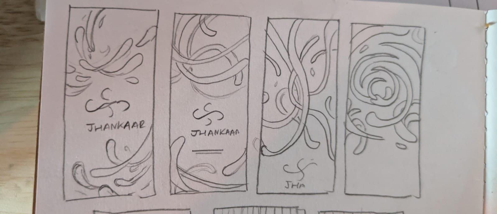
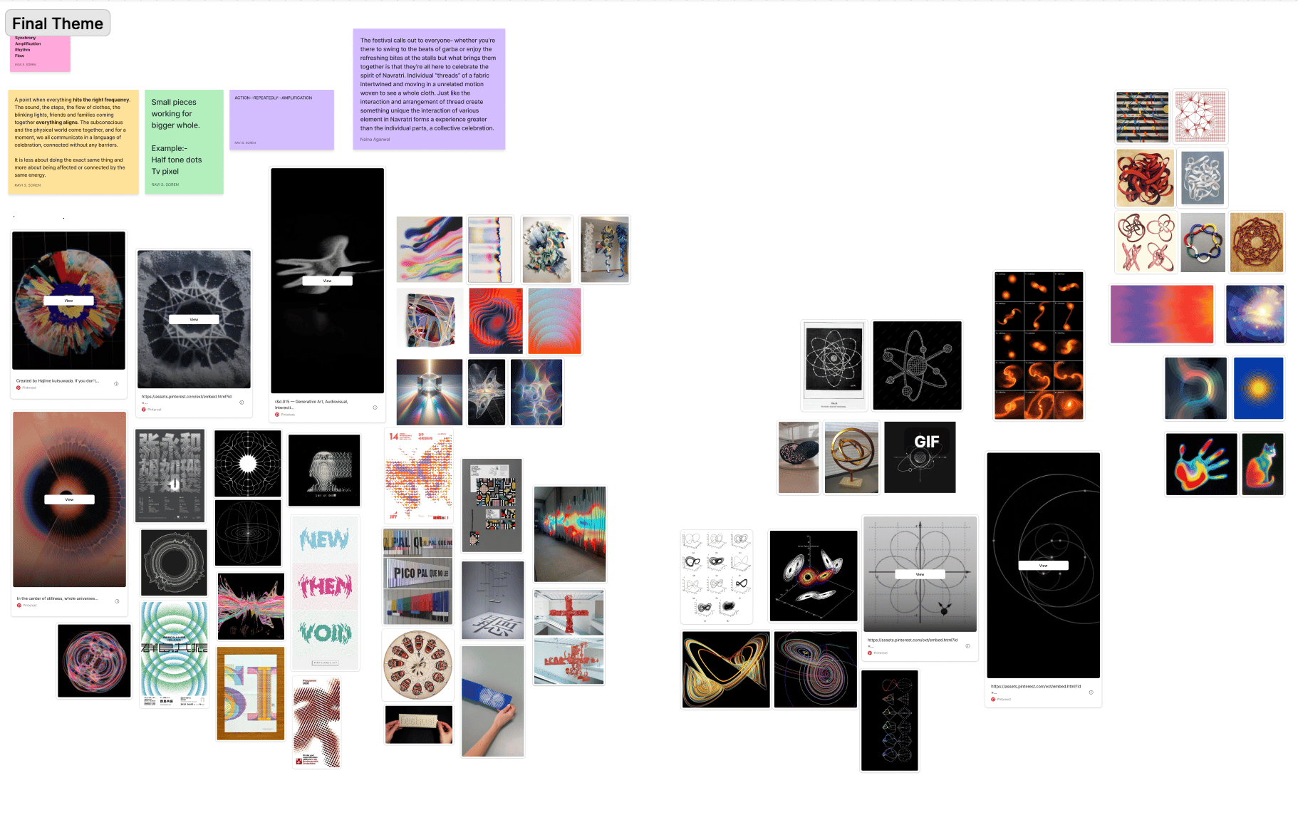
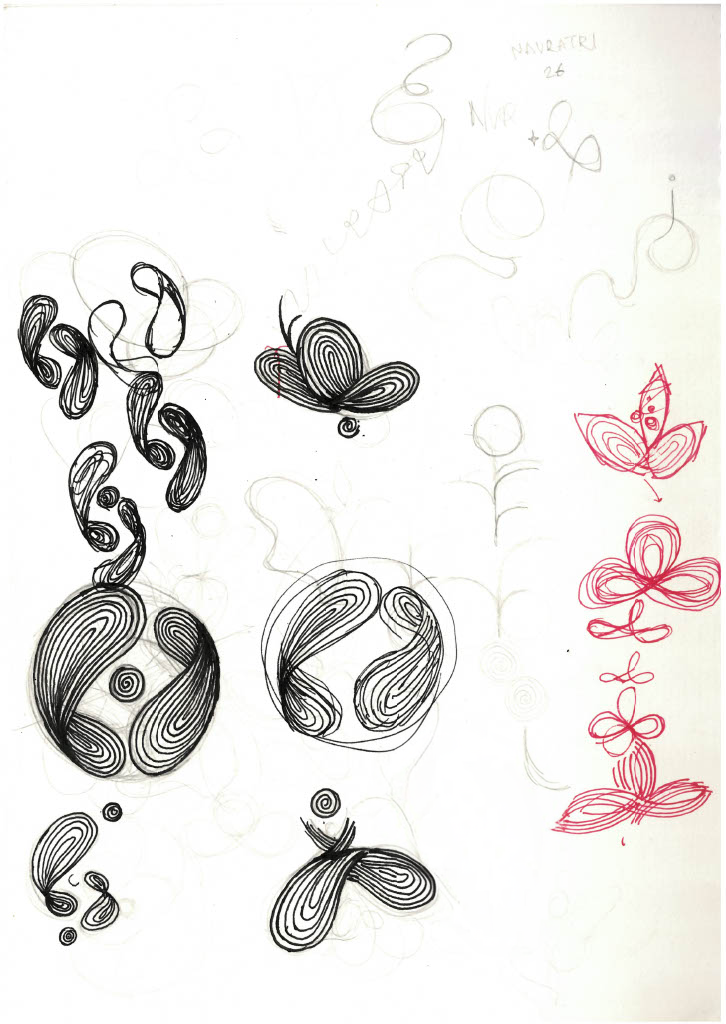
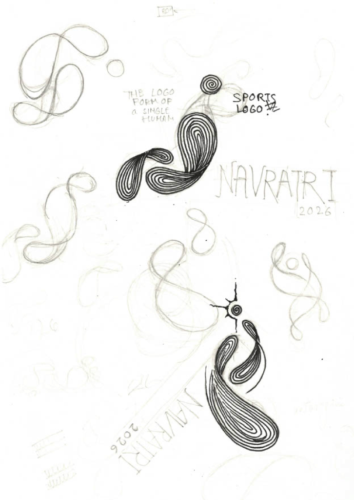
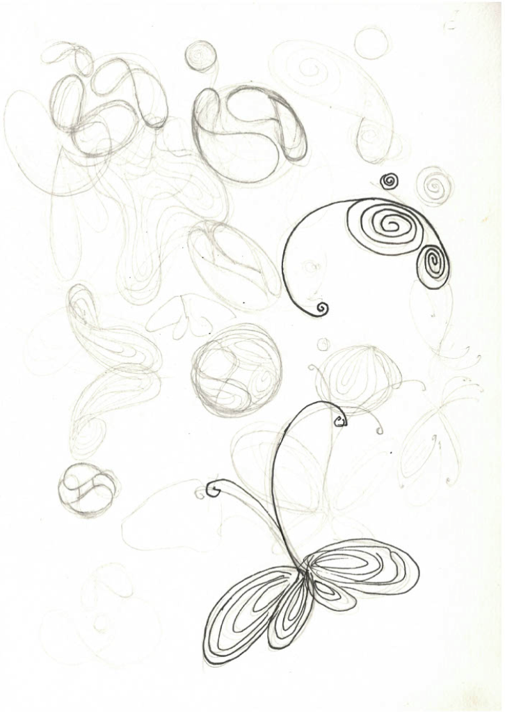
After several rounds of moodboarding, we came up with a concept together. We then explored initial ideas through sketches and, after a lot of back and forth, settled on a
final form inspired by thread.
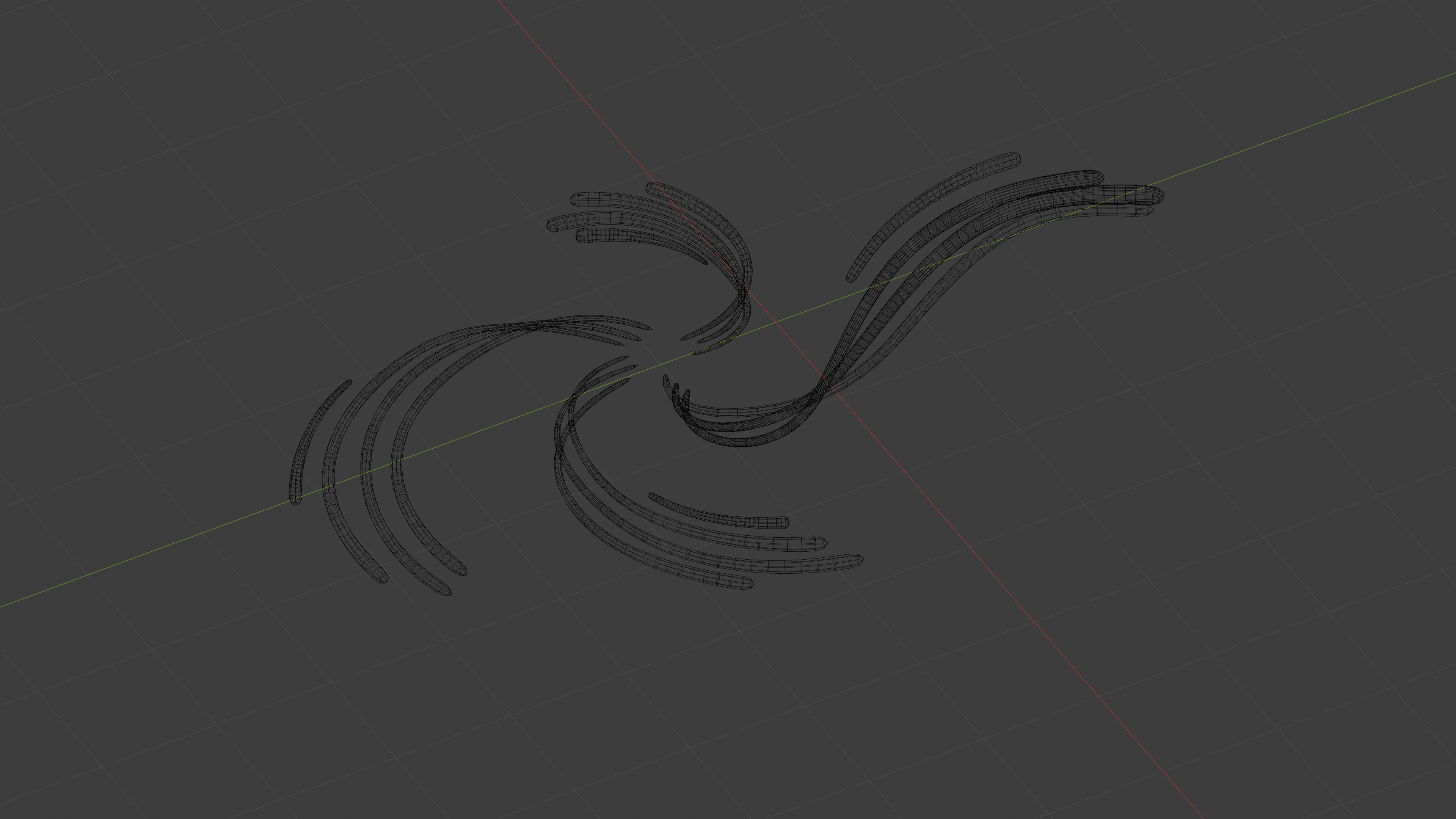
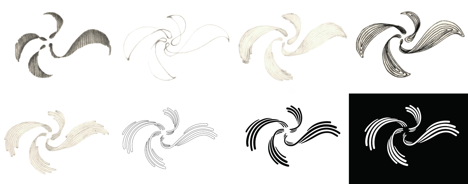
The logo draws inspiration from repeating resonance patterns and the echoing nature of sound as it spreads outward from a central point. Each strand represents a unique rhythm, coming together and aligning at a precise moment to amplify one another, creating a collective resonance.
The final form was then modelled in 3D using Blender.
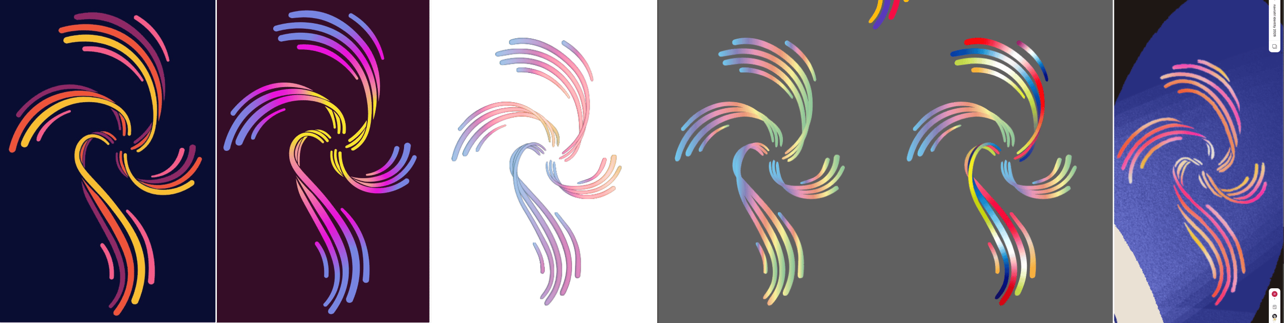
After vectorising the form, we explored various colour combinations, but none felt
quite right. Some lacked sufficient contrast, while others felt too generic.
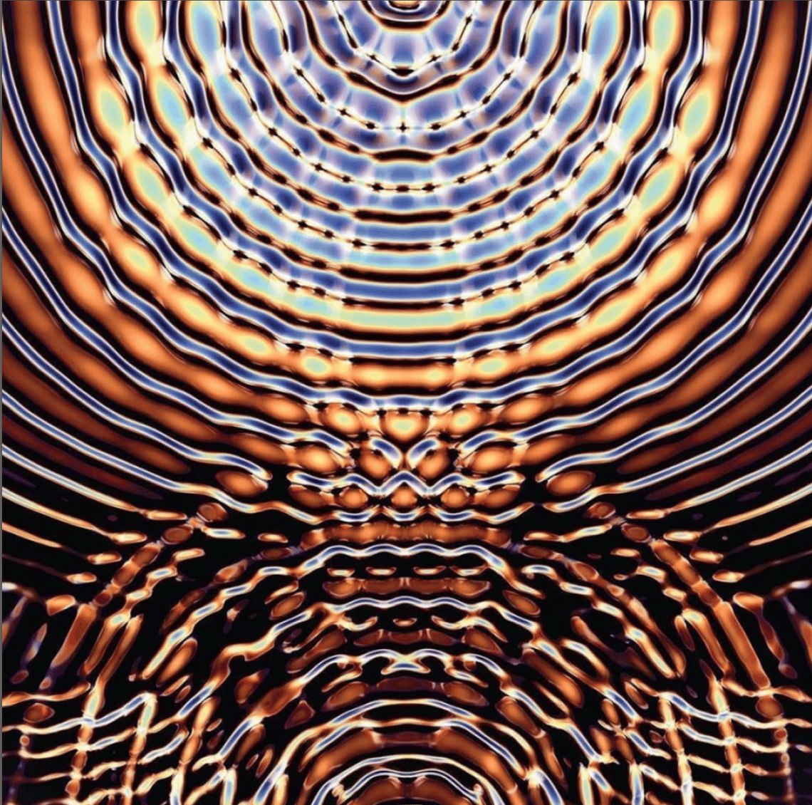
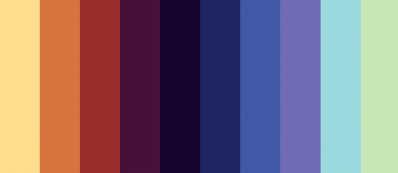
We tried a completely different approach. Previous identities typically leaned towards either warm or cool colours, so we decided to bring the two palettes together. Using
this reference image, we picked out a colour palette that combined both.
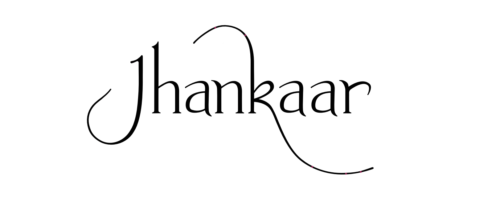
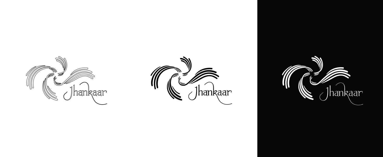
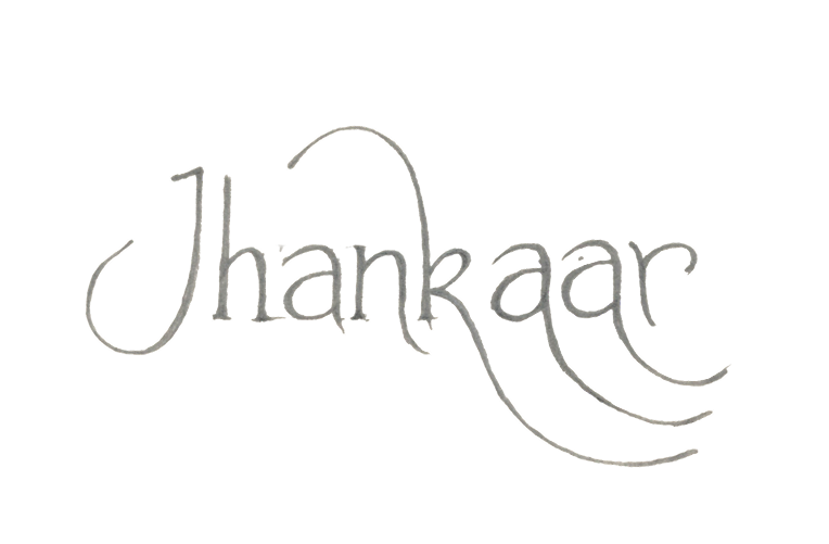
For the wordmark, we decided to hand-letter it. After a few rounds of refinement, we brought the wordmark and the other elements together to create the final logo.
Final logo variations in English and Gujarati.
This is the final logo animation with sound.
Next, we needed a visual concept to tie the logo together with the rest of the
collateral. We explored string painting as a visual direction, but after trying it out, we
weren’t fully convinced.
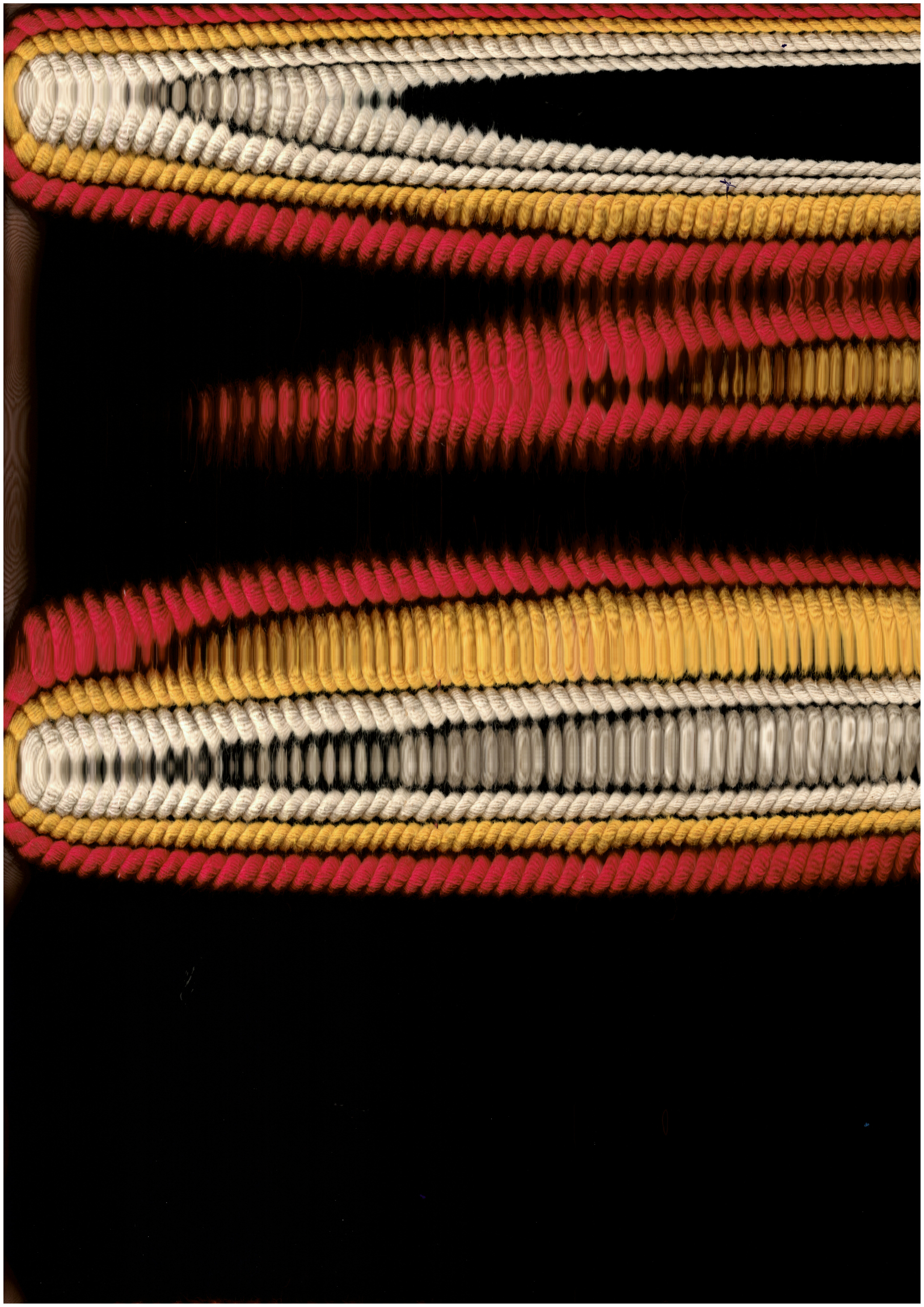
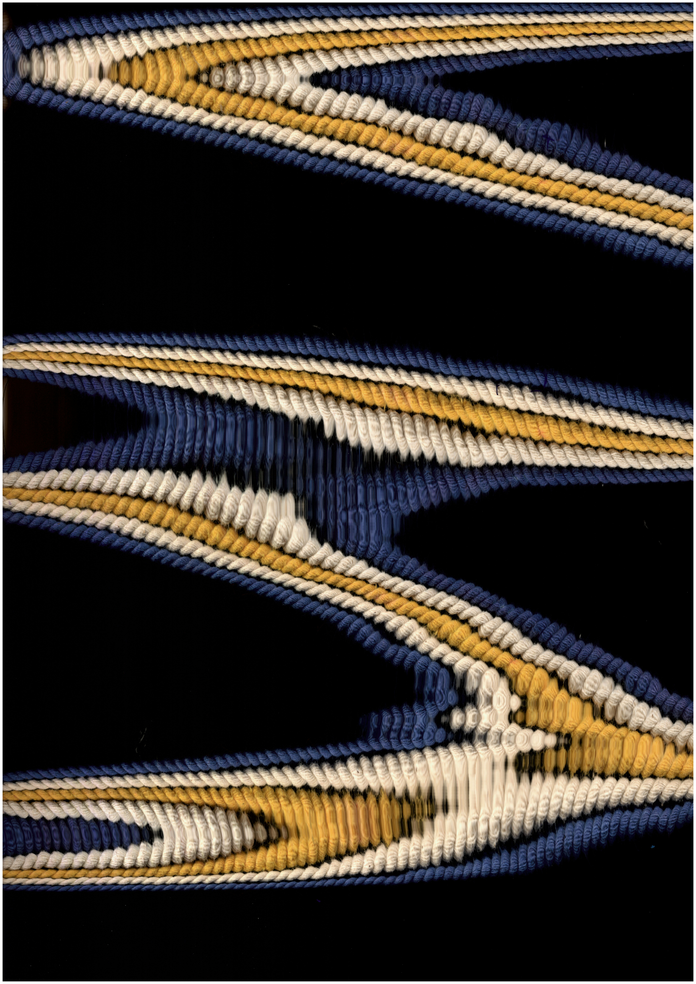
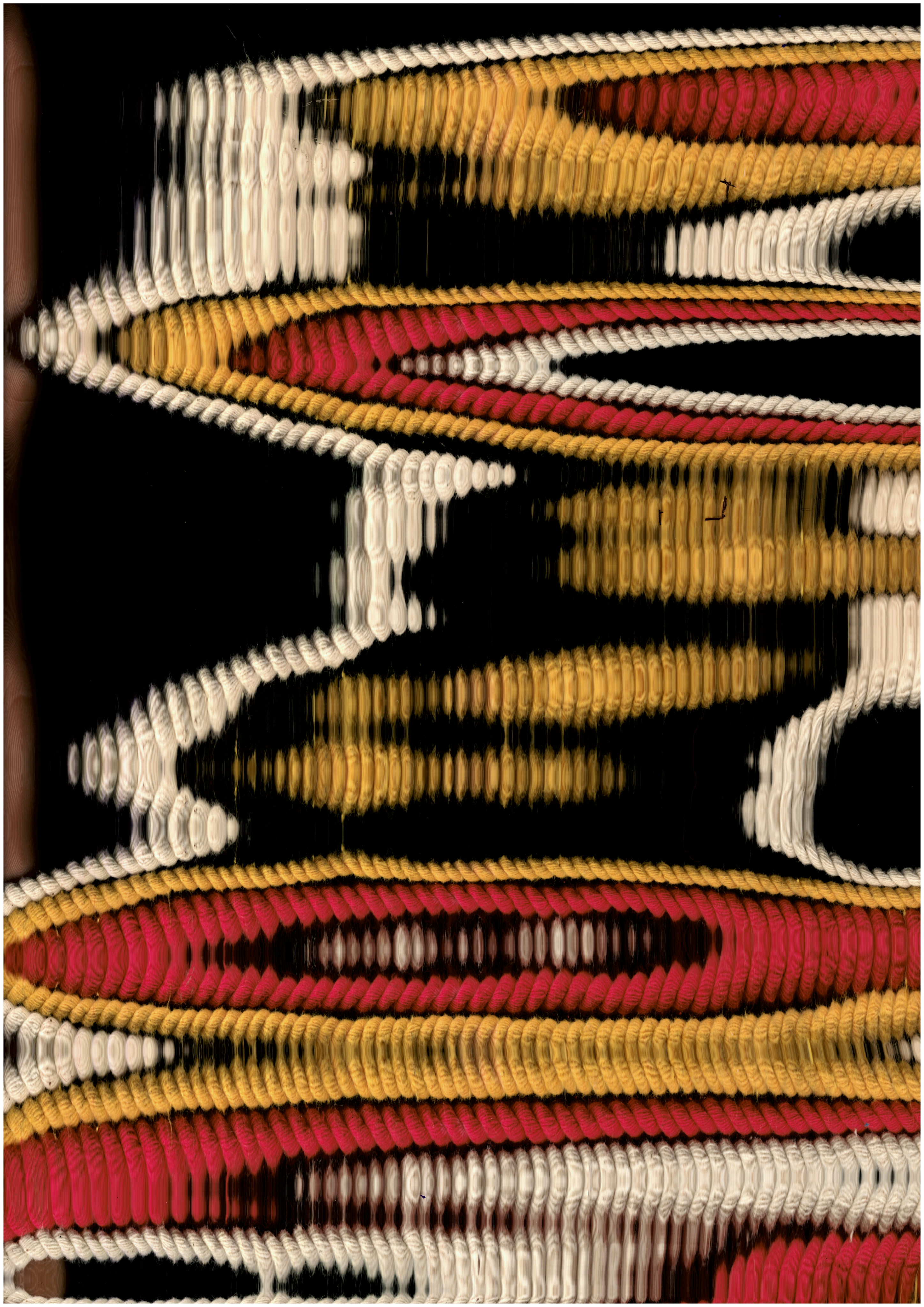
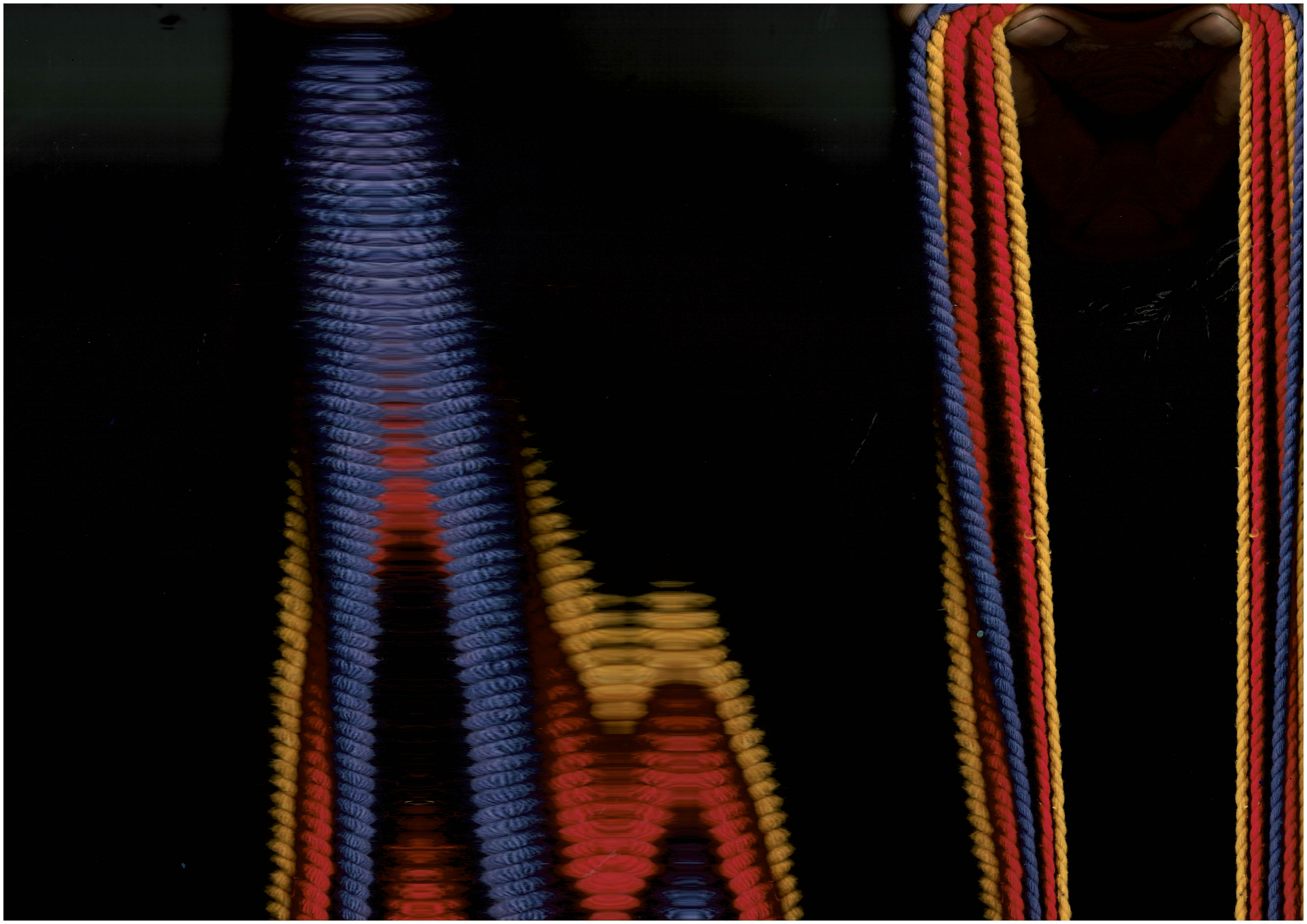
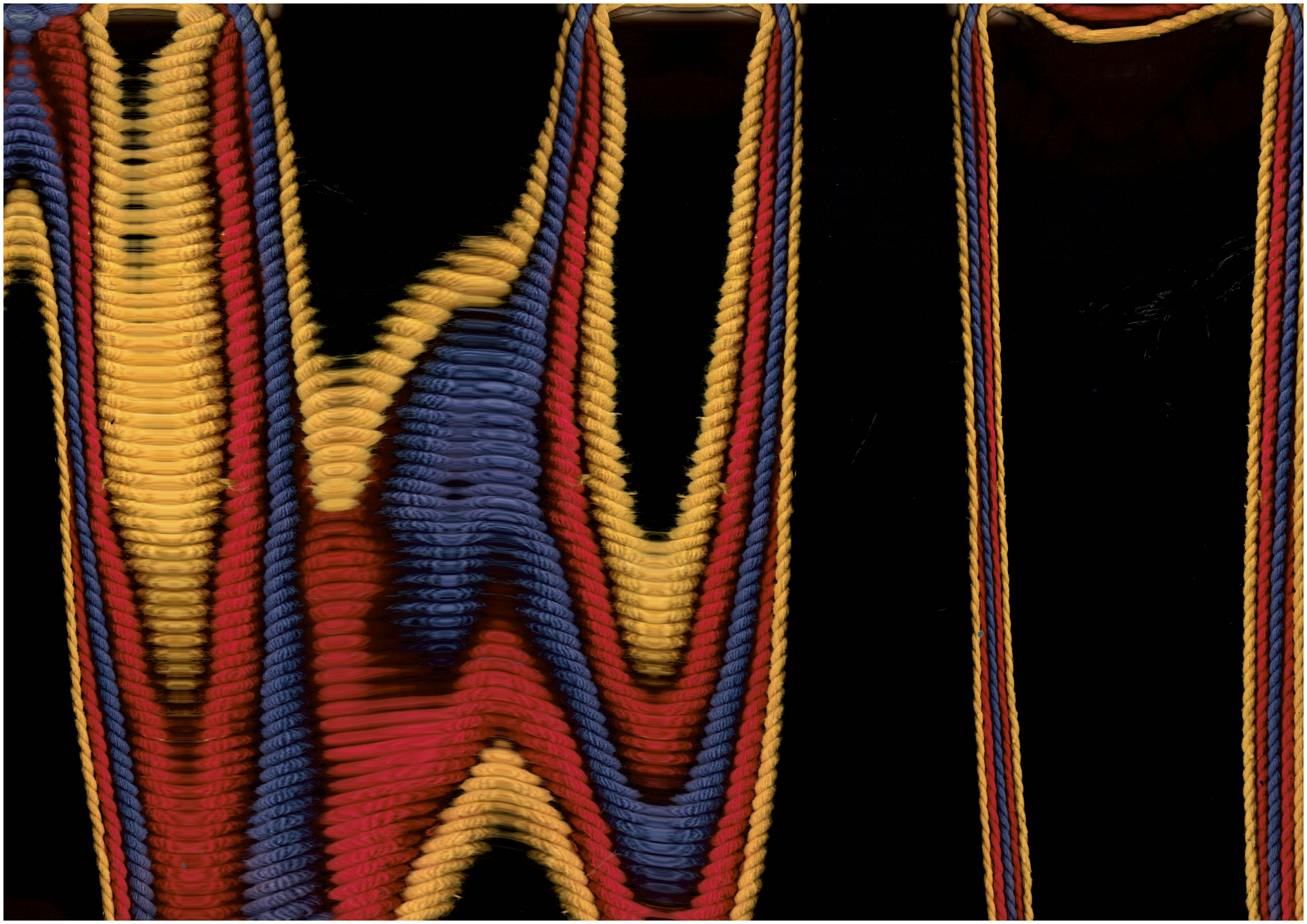
We then experimented with scanning the thread directly while moving it across the
scanner, similar to the process of string painting.
After a lot of trial and error, we got some interesting scans of the thread. The process created a sense of fluid movement while retaining the thread’s original texture and
colour.
We then edited the textures in Photoshop and applied them to the logo and social media posts, bringing the entire identity together.
Garba is traditionally performed in concentric circles. This post serves as a guide for
attendees to help them navigate the event.
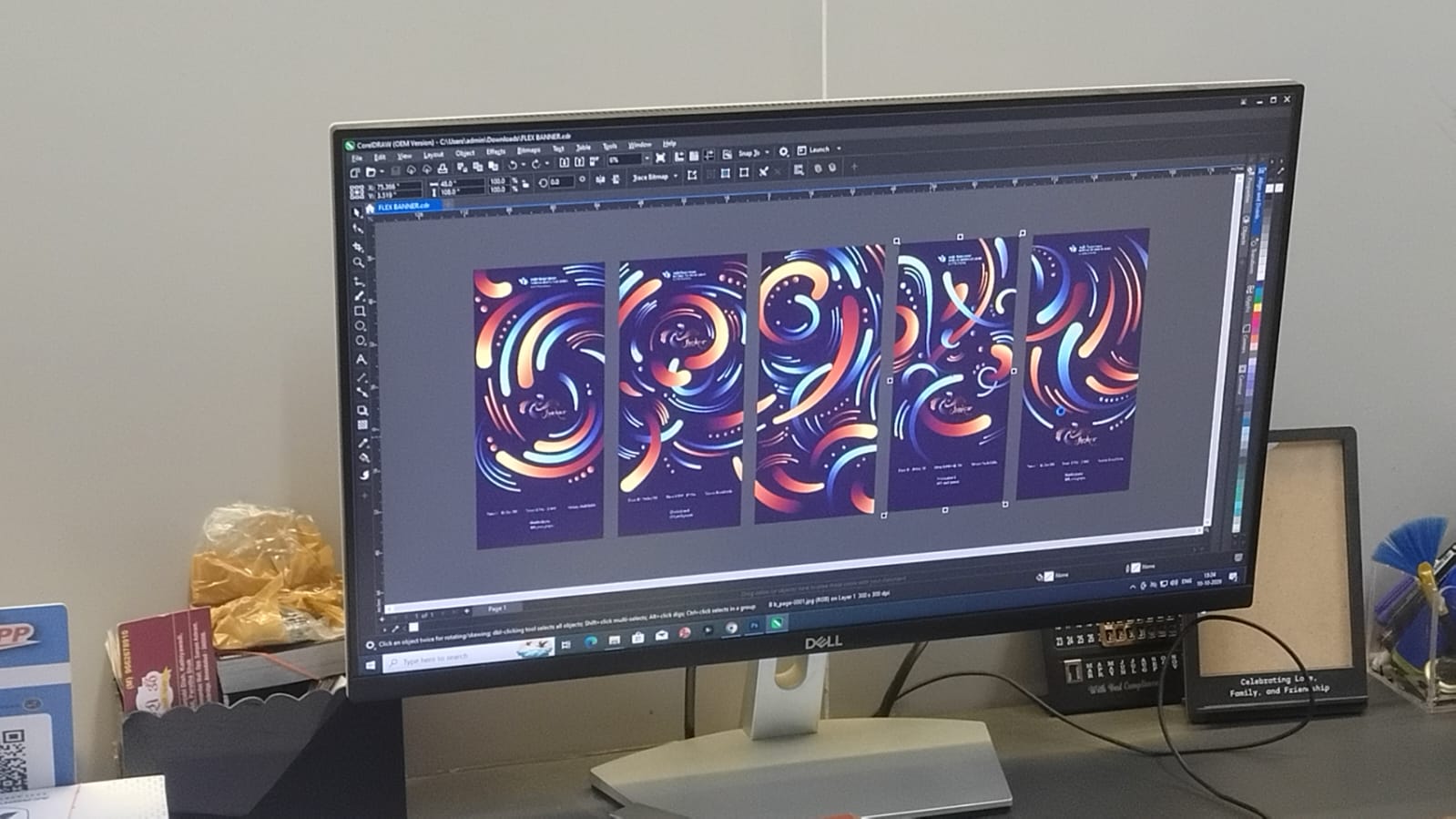
We then moved on to the collaterals, starting with five banners to be placed across
the NID campus to inform visitors about the event.
We quickly ran into a problem: the scanned thread textures were too small for the
banners, and enlarging the A3 images would compromise their quality.
But we needed the banners to feel like part of the same visual identity, so we looked
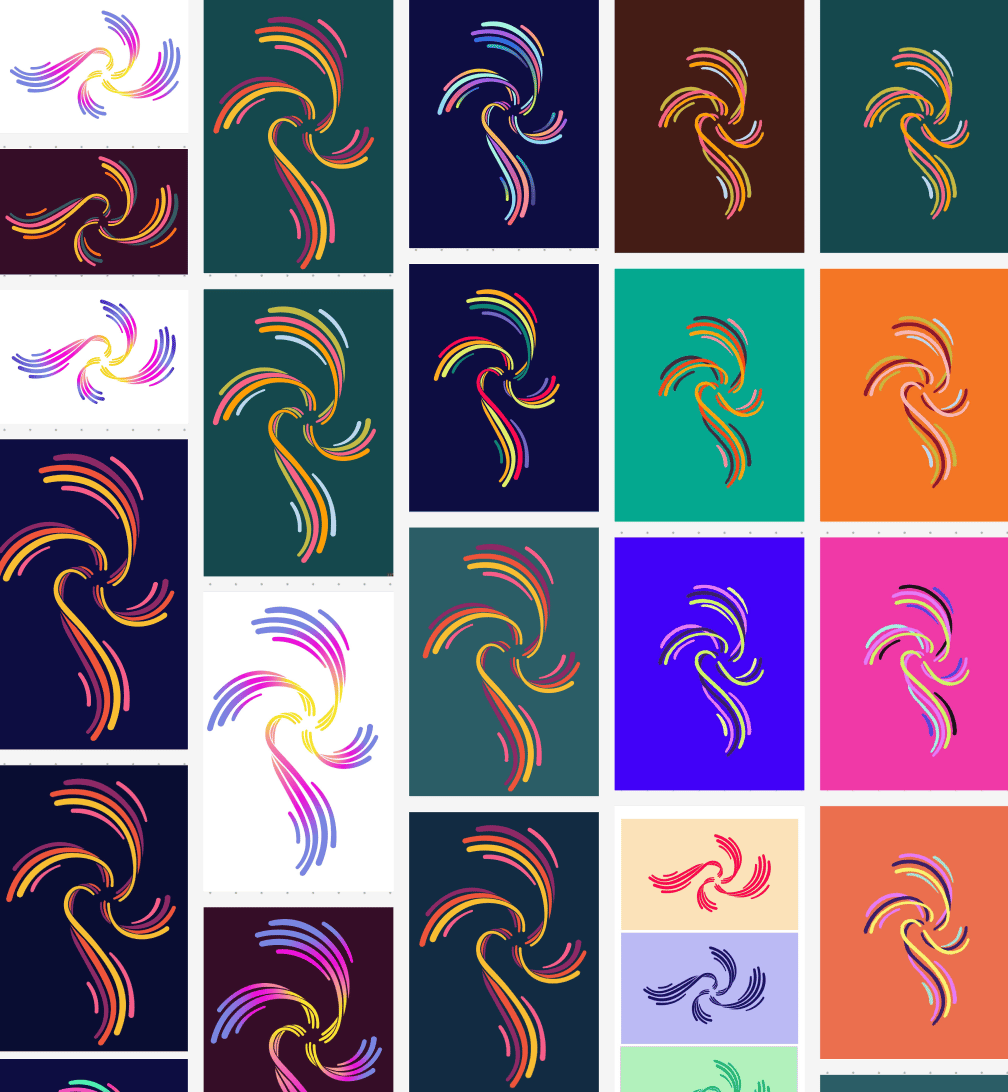
at the logo itself and decided to use its vector lines as the visual element.
We created vector shapes that continued the flow of the lines, carrying the visual
language of the logo onto the banners. Each banner measured 4 ft wide and 9 ft tall.
Next we worked on the invites.
For the physical invite that would be sent to faculty and other important guests for the event, we wanted to try out an analogue lenticular animation of the logo which would move when the guest pulled out the invite from its case as viewed from the laser cut slits.
The invites were screen-printed at the Print Labs at NID.
Other collateral
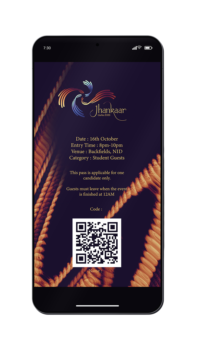
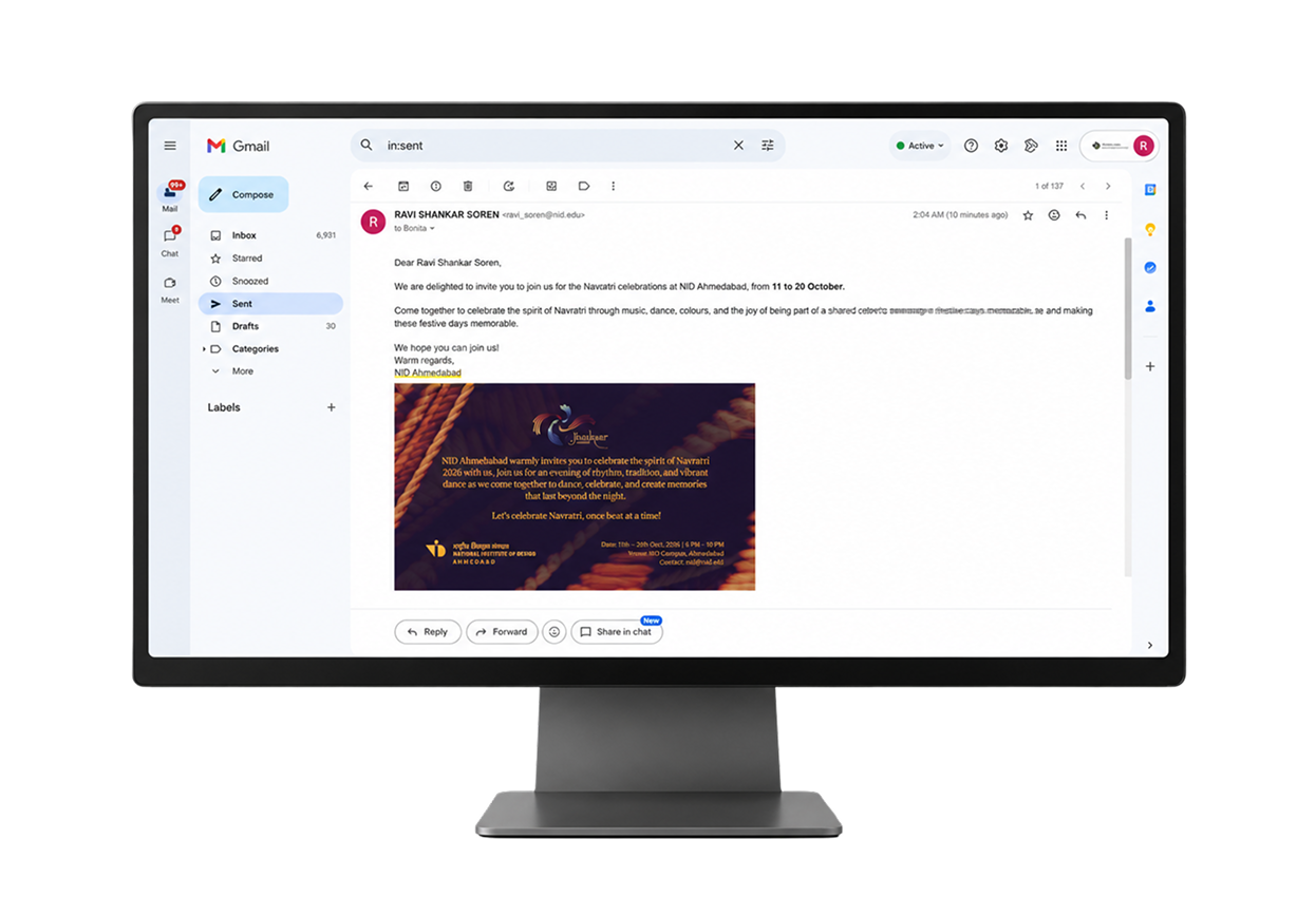
These are digital passes and invites for Garba 2026.
click for full figjam
Concept:
Jhankaar
Jhankaar is a point when everything hits the right frequency. The sound, the steps, the flow of clothes, the blinking lights, the energy of friends and families each exists in its own rhythm, but somehow they resonate with one another. It is about individual
elements coming together and giving a sense of harmony. It’s a sound that lingers,
then builds transforming separate moments into a shared celebration.
Navratri is where this frequency comes alive.
The festival calls out to everyone whether you're there to dance to the beats of garba or enjoy the food at the stalls but what brings them together is that they're all here to
celebrate the spirit of Navratri. As the night unfolds, their energies begin to interact.
The dhol, the claps, the footsteps,
the twirl of a chaniya choli, the lights, and the crowd all fall into a collective rhythm.
Jhankaar is this amplification through alignment, the moment when individual
rhythms build upon one another, creating a frequency that everyone can feel.
I worked on the logo, visual identity system and banners but also pitched in ideas for the other collaterals-including invites.
About
Contact
Work
Play
check out the instagram page

OXID.
F+F Kantine
Measuring The Lotus
D/SIGNED
Dhal ni Pol
Top
More Figma!